
With all the tools democratizing machine learning these days, it’s easier than ever to build high accuracy machine learning models. But even if you build a model yourself using an open source framework like TensorFlow or Scikit Learn, it’s still mostly a black box - it’s hard to know exactly why your model made the prediction it did. As model builders, we’re responsible for the predictions generated by our models and being able to explain these predictions is an important part of preventing bias in ML. In this post I’ll explore what bias means in machine learning, along with some techniques for preventing it.
Where can bias be introduced?
It’s easy to take your model’s accuracy as the only indicator of how well it’s performing. Let’s say we’ve trained a model to recognize images of 10 different cat breeds. We trained it on 5,000 images of each cat breed, and it’s 99.95% accurate. Sounds ok so far, right?
Bias in training data
Now we’ve deployed it in production and someone comes along and uploads a dog photo. Because our model’s entire “world view” is the 10 cat breeds we’ve trained it on, we can’t expect it to magically know that this is “not a cat.” Instead, it will try to categorize it into the only labels it has learned, so it’ll likely assign one of the cat breed labels with high confidence. To get in the mindset of a machine learning model, think of it like learning a new language. If I’m traveling to Japan and only know 10 words of Japanese, I’ll respond to every situation I encounter with one of the 10 words that most closely resembles what’s happening even if it’s far from the correct way to express what I want to say.
This is a case of biased training data, where your training data doesn’t accurately represent the users of your model. To address this, ensure you’ve got a diverse representation of training data across a variety of dimensions. And this applies to any type of dataset, not only images. If you’re building a model with numerical and categorical data to predict whether or not someone will default on a loan, you’ll want to make sure that data includes a diverse representation of users by age, gender, credit history, and other demographic factors. If you’re using pandas with tabular data, this is as simple as checking the value counts for a specific column:
import pandas as pd

data = pd.read_csv("path/to/your/data.csv")
print(data['stackoverflow_tags'].value_counts())

tensorflow                         32626
scikit-learn                       13333
keras                               8231
If you’re training a model on free form text, you’ll want to make sure the style of that text matches the type of text you expect to generate predictions on. For example, if you train a model to identify sentiment in text but you train it only on tweets, it might not do as well if you ask it to identify the sentiment of an email.
Bias in data labeling
Since ML models often require lots of training data to achieve high accuracy, a common practice is to have a team of people help label the data (labeling maybe even outsourced). Here are some things to think about to prevent bias being introduced in the labeling phase:
- Who is labeling your data?
- Do they have expertise in the domain of your data? Should they?
- Do they have strong opinions about the data being labeled?
If you’re building a model to identify clothing styles from images, you might not have good results if your labelers don’t know anything about fashion. On the other hand, if your labelers are too close to the subject matter of your data they may also introduce biases. Let’s say you’re having people assign sentiment labels (like ‘happy’, ‘angry’, ‘annoyed’, etc.) to a dataset of political text documents. If they feel strongly about the subject of the text, it might influence how they assign labels.
How can you identify bias?
It’s good to be aware of how bias can be introduced to ML models, but it’s better if you can take steps to fix it. Luckily there are some tools to help with this! Here I’ll focus on the open source library SHAP: an approach to explaining the output of any ML model. To show you how it works we’ll need a model to interpret. I’ll use this World Happiness Report dataset from Kaggle to train a simple model. It’s a very small dataset, but it’ll train quickly and provide a good intro to using SHAP since the dataset is entirely numerical.
Building a model to predict a country’s Happiness Index
Each year a group of economists rate countries by “happiness” as determined by a few factors they’ve quantified. The Kaggle dataset consists of data through 2017. I’ve used this to train a model, and then grabbed 2018 data from the World Happiness Site to see how the model performed. First, we’ll explore the data using pandas:
data = pd.read_csv('16-17-happiness-scores.csv')

# Shuffle the data
data = data.sample(frac=1)

# Print the first 5 rows
data.head()
Here’s what it looks like:
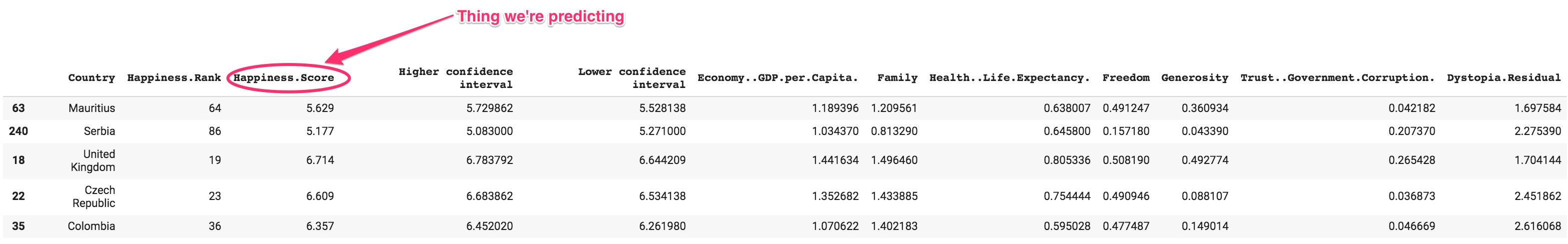
We’ll get rid of a few of those columns before training our model. Country won’t be meaningful since it’s unique for every row. I’ll also remove Happiness.Rank along with the higher and lower confidence intervals since including this in our training data would kind of be cheating:
labels = data['Happiness.Score']
data = data.drop(columns=['Country','Happiness.Rank', 'Happiness.Score', 'Higher confidence interval', 'Lower confidence interval'])
Then we can split our data into train and test sets:
train_size = int(len(data) * .8)

train_data = data[:train_size]
train_labels = labels[:train_size]

test_data = data[train_size:]
test_labels = labels[train_size:]
Now we’ve got 7 numerical features we’ll be using to train our model to predict a country’s happiness score. Here’s sample training data for one country:
Economy..GDP.per.Capita.         1.189396
Family                           1.209561
Health..Life.Expectancy.         0.638007
Freedom                          0.491247
Generosity                       0.360934
Trust..Government.Corruption.    0.042182
Dystopia.Residual                1.697584
Name: 63, dtype: float64


Happiness score:
5.62900018692017
I’ll build the model using the Keras Sequential model API. This is one of my favorite ways to build models because the syntax is so simple. I want to build a model that has an input layer, 2 hidden layers, and an output layer. Something like this:
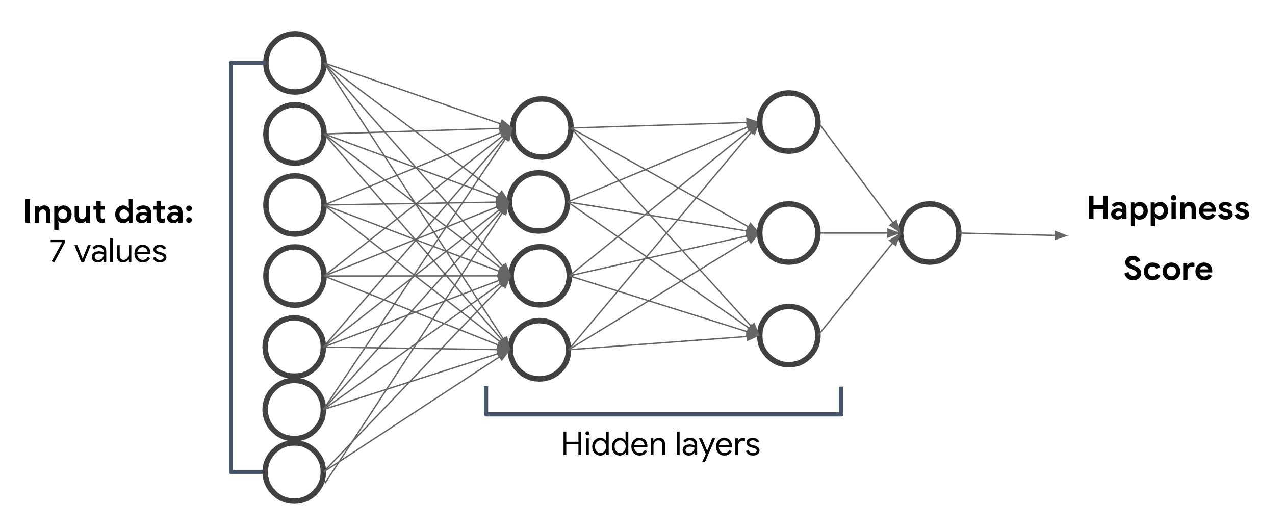
The hidden layers in the image above are what make this a deep neural network. If it only had an input and output layer it would be a linear model. The output of the hidden layers isn’t really meaningful to us, but our model will use them to represent complex relationship between our model’s inputs and outputs. With Keras, we can easily represent the above diagram in just four lines of code:
model = tf.keras.Sequential(name="happiness")
model.add(tf.keras.layers.Dense(100, input_dim=7, activation='relu'))
model.add(tf.keras.layers.Dense(50, activation='relu'))
model.add(tf.keras.layers.Dense(1))
Then we’ll compile the model so we can train it. The great thing about Keras is that we don’t have to worry how the loss and optimization functions are implemented, we just need to know the right ones to use:
model.compile(loss='mean_squared_error', optimizer='adam')And we can train our model with one line of code:
model.fit(train_data, train_labels, epochs=70, batch_size=64, validation_split=0.1)Our model’s validation loss is very close to its training loss, which is a good indication that it’s learning. And when we generate predictions on the first 3 examples from our test set, our model’s predictions are very close to the ground truth values:
predict = model.predict(test_data[:5])

for i, val in enumerate(predict):
  print('Predicted happiness score: {}'.format(val[0]))
  print('Actual happiness score: {} \n'.format(test_labels.iloc[i]))

# Prediction output
Predicted happiness score: 3.3846967220306396
Actual happiness score: 3.36

Predicted happiness score: 4.6532135009765625
Actual happiness score: 4.643

Predicted happiness score: 5.61192512512207
Actual happiness score: 5.615
Interpreting our model with SHAP
Up until recently I’d probably stop here. But as much as I love magic I also really wanted to learn how machine learning models make predictions. Using SHAP, we can better understand which of our model’s features are most impactful in its predictions. First step is to import it along with matplotlib for visualizations:
import shap
import matplotlib.pyplot as plt
Then we’ll create a DeepExplainer object using a subset of our training data:
attribution_data = np.array(train_data[:50])
explainer = shap.DeepExplainer(model, attribution_data)
And then we can get our explainer’s shap_values for our test data. This will assign attribution values to each of our features, so we can see how each one contributed to an individual prediction:
shap_values = e.shap_values(np.array(test_data[:10]))We can see the output in a pandas DataFrame:
features = train_data.columns.values.tolist()

df= pd.DataFrame(data=np.array(shap_values)[0], columns=features)
display(df)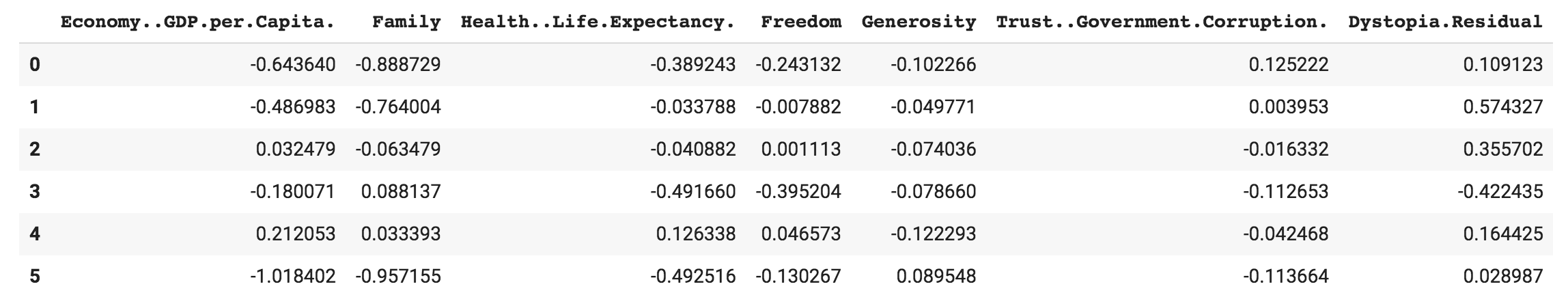
The positive values indicate features that pushed our model’s prediction up, and vice versa for negative values. The SHAP values are easier to understand in a graph which we can generate with matplotlib:
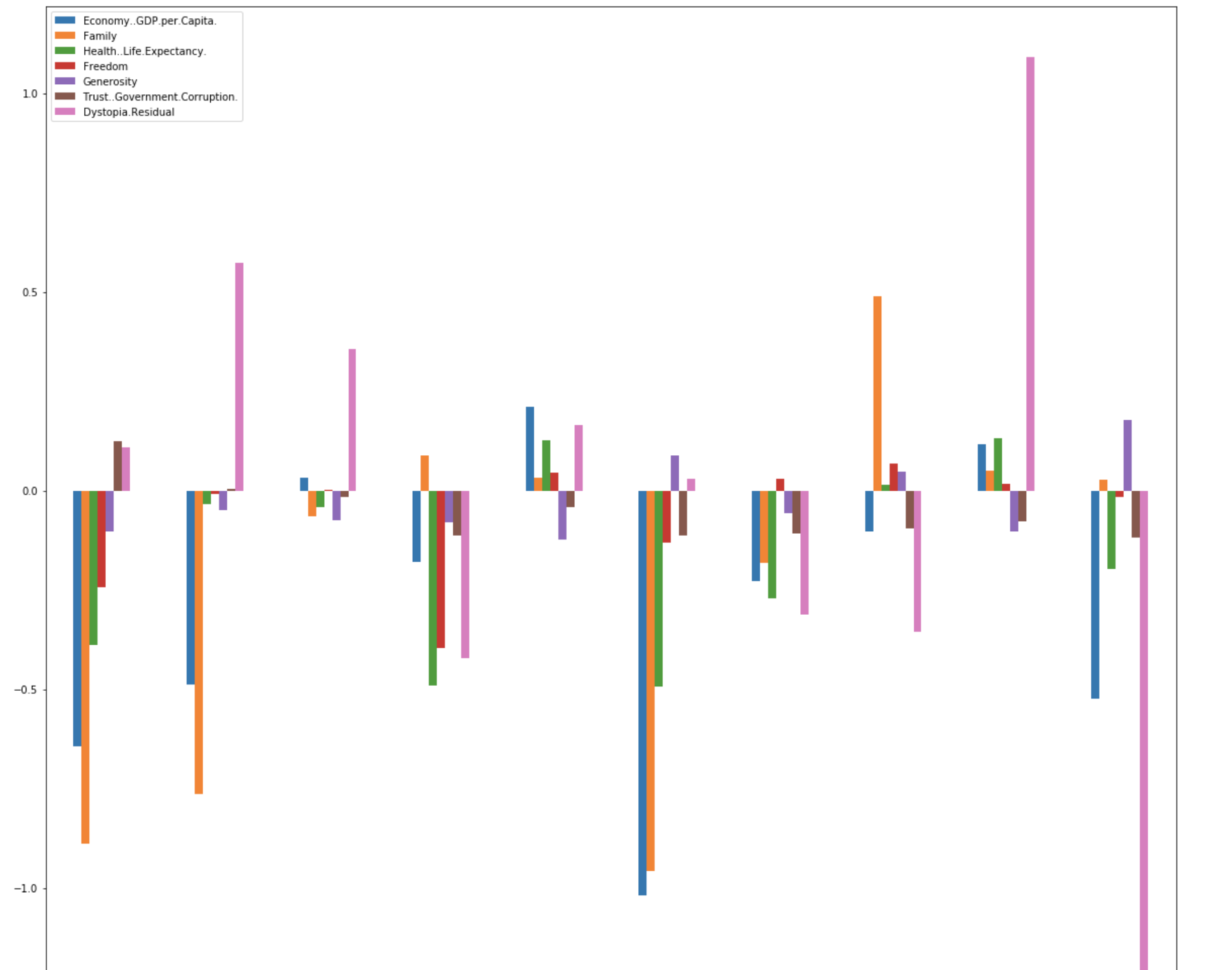
plt.rcParams['figure.figsize'] = [20, 20]
plt.figure()
df1= pd.DataFrame(data=np.array(shap_values)[0], columns=features)
df1.plot(kind='bar')
Here we can see the attribution values for each of the first 10 examples in our test set. It looks like the value of the Dystopia.Residual feature contributed most to high happiness score predictions, and low happiness score predictions were influenced most by GDP, Family, and Health:
But how does this relate to bias? We can use this data to see if there are features influencing our predictions in ways they shouldn’t be. Maybe we have a model trained on demographic data, and age is the feature our model is using most. This could be causing our model to treat a subset of users unfairly and the attribution values can help us identify these biases. In addition to identifying attribution on single examples, SHAP can do lots of other things like help us interpret models for image or text classification. I plan to cover those in a future post, stay tuned :)
Bonus: deploying this model to Cloud ML Engine
Because we may want more than just one person to be able to use our model, it would be cool to deploy it to the ☁. We’ll use Cloud ML Engine for this. My teammate Martin has a great notebook on how to do this for TPU models. I’ve adapted it for this model here. All we need to do is create a serving layer, add it to our model, and then export it:
class ServingInput(tf.keras.layers.Layer):
  def __init__(self, name, dtype, batch_input_shape=None):
    super(ServingInput, self).__init__(trainable=False, name=name, dtype=dtype, batch_input_shape=batch_input_shape)
  def get_config(self):
    return {'batch_input_shape': self._batch_input_shape, 'dtype': self.dtype, 'name': self.name }

restored_model = model
restored_model.set_weights(model.get_weights())

# Add the serving input layer
serving_model = tf.keras.Sequential(name="happiness")
serving_model.add(ServingInput('serving', tf.float32, (None, 7)))
serving_model.add(restored_model)
export_path = tf.contrib.saved_model.save_keras_model(serving_model, '/tmp')
export_path = export_path.decode('utf-8')
print("Model exported to: ", export_path)
We can deploy it to ML Engine using the gcloud CLI. If you’re running this from a notebook, just run !gcloud auth login before this command and add a ! to run it as a shell script:
gcloud ml-engine versions create 'v1' --model=happiness --origin={export_path} --project='your-gcp-project' --runtime-version=1.13 --staging-bucket='gs://path/to/your/gcs/bucket'Once it’s deployed, we can test it out with a gcloud command for generating predictions. First we’ll save some test data to a JSON file:
{"serving_input": [0.262,0.908,0.402,0.221,0.155,0.049,1.778]}
{"serving_input": [1.090,1.387,0.684,0.584,0.245,0.050,1.851]}
{"serving_input": [1.340,1.573,0.910,0.647,0.361,0.302,2.139]}
And then we can send those to our model for predictions:
gcloud ml-engine predict --model='happiness' --json-instances predictions.json --project='your-gcp-project'Now we’ve got a model in the cloud, and we know how to interpret its predictions! To recap, we learned:
- What bias means in ML
- Two ways ML models can become biased: training datasets and data labeling
- How to address bias with the SHAP framework
- How to deploy models to Cloud ML Engine
I covered a lot here and I’m new at hosting my own blog so I’d love your feedback. Give me a shout on Twitter @SRobTweets to let me know what you think.