
Finance is one industry where interpreting the output of a machine learning model can be particularly useful. In finance, ML models can be used to determine things like whether someone will be approved for a credit application, or the future performance of a stock. In this case simply getting the prediction from an ML model won’t be enough.
You’ll likely need to know why your model made a specific prediction for two reasons:
- As a model builder, this information can help you make sure your training dataset is balanced and your model is not making biased decisions
- As a model end user, you’ll probably want to know why a model rejected or accepted your credit application
In this post I’ll use SHAP, the What-if Tool, and Cloud AI Platform to interpet the output of a financial model.
The dataset
First we’ll need a dataset. For that we’ll use this mortgage data from the Federal Financial Institutions Examination Council. As a result of the Home Mortgage Disclosure Act of 1975, lending institutions are required to report public loan data, which is good news for us as model builders 👍 I know mortgage data doesn’t exactly spell party, but I promise the results will be interesting.
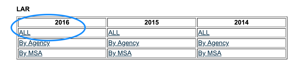
We’ll grab the data from 2016 by downloading the zip files labeled ALL under the LAR section (Loan Application Register):
If you’re interested in what all of the different column values mean, check out the HMDA’s code sheet. I’ll also dive into this later in the interpretability section. I’ve done some pre-processing on the data and made a smaller version available in Cloud Storage. I’ll be using Cloud AI Platform Notebooks to run the code for this, but you can also run it from Colab or any Jupyter notebook.
Preparing data
Depending on the notebook environment where you’re running this, you’ll need to install a few packages we’ll be using in this analysis. If you don’t have shap, witwidget, or xgboost installed, do a quick pip install to download them.
Then import all of the libraries we’ll be using for this analysis:
import pandas as pd
import xgboost as xgb
import numpy as np
import collections
import witwidget

from sklearn.model_selection import train_test_split
from sklearn.metrics import accuracy_score, confusion_matrix
from sklearn.utils import shuffle
from witwidget.notebook.visualization import WitWidget, WitConfigBuilder
Next we’ll upload the CSV of 2016 data to your notebook instance so we can read it as a Pandas DataFrame. In order to do that we’ll first create a dict of the data types Pandas should use for each column:
COLUMN_NAMES = collections.OrderedDict({
 'as_of_year': np.int16,
 'agency_code': 'category',
 'loan_type': 'category',
 'property_type': 'category',
 'loan_purpose': 'category',
 'occupancy': np.int8,
 'loan_amt_thousands': np.float64,
 'preapproval': 'category',
 'county_code': np.float64,
 'applicant_income_thousands': np.float64,
 'purchaser_type': 'category',
 'hoepa_status': 'category',
 'lien_status': 'category',
 'population': np.float64,
 'ffiec_median_fam_income': np.float64,
 'tract_to_msa_income_pct': np.float64,
 'num_owner_occupied_units': np.float64,
 'num_1_to_4_family_units': np.float64,
 'approved': np.int8
})
Then we can create the DataFrame, shuffle the data, and preview it:
data = pd.read_csv(
 'mortgage-small.csv',
 index_col=False,
 dtype=COLUMN_NAMES
)
data = data.dropna()
data = shuffle(data, random_state=2)
data.head()
You should see something like this in the output:
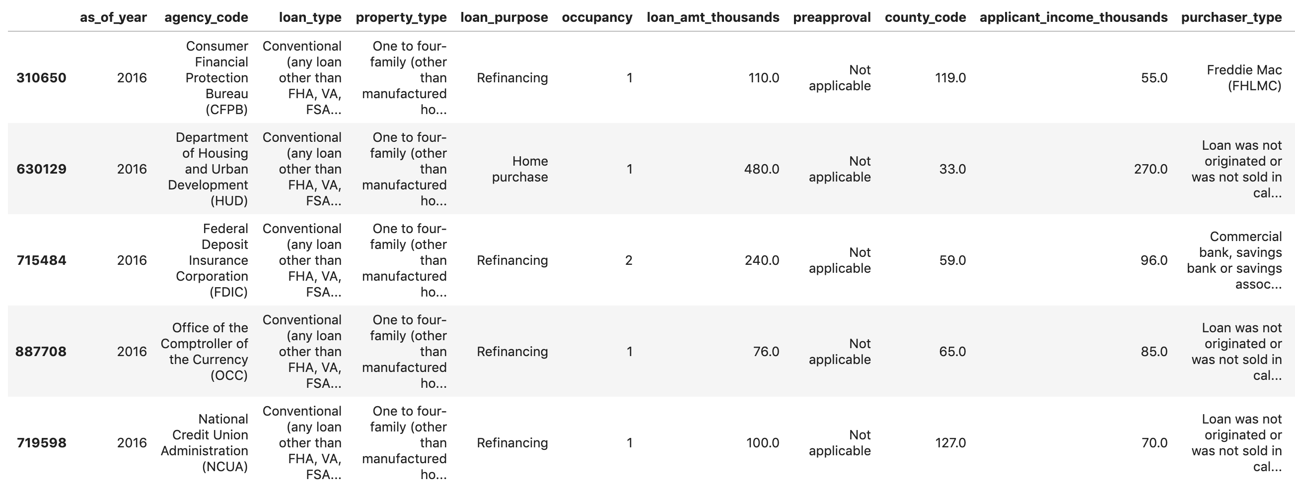
If you scroll all the way to the end, you’ll see the last column approved, which is the thing we’re predicting. A value of 1 indicates a particular application was approved, and 0 indicates it was denied.
To see the distribution of approved / denied values in the dataset, run the following:
labels = data['approved'].values
data = data.drop(columns=['approved'])

print(labels.value_counts())
You’ll see that about 66% of the dataset contains approved applications.
Something we should look out for: When the number of examples for each label in our dataset is slightly imbalanced, if our model accuracy is close to the exact ratio of approved / denied items in the dataset (66% in this case) it means the model is likely just guessing at random. However, if we can achieve accuracy significantly higher than 66%, our model is learning something.
Building an XGBoost model
Why did I choose to use XGBoost to build the model? While traditional neural networks have been shown to perform best on unstructured data like images and text, decision trees often perform extremely well on structured data like the mortgage dataset we’ll be using here.
Time to build the model 👩🏻💻
Let’s split our data into train and test sets using Scikit-learn’s handy train_test_split function:
features = data
x,y = features,labels

x_train,x_test,y_train,y_test = train_test_split(x,y)
Building our model in XGBoost is as simple as creating an instance of XGBClassifier and passing it the correct objective for our model. Here we’re using reg:logistic since we’ve got a binary classification problem and we want the model to output a single value in the range of (0,1): 0 for not approved and 1 for approved:
model = xgb.XGBClassifier(
    objective='reg:logistic'
)
You can train the model with one line of code, calling the fit() method and passing it the training data and labels.
model.fit(x_train, y_train)Training will take a few minutes to complete. Once it’s done, we can get the accuracy of our model using Scikit Learn’s accuracy_score method:
y_pred = model.predict(x_test)
acc = accuracy_score(y_test, y_pred.round())
print(acc, '\n')
For this model we get around 87%. Exact accuracy may vary if you run this yourself since there is always an element of randomness in machine learning. You’ll also get higher accuracy if you use the full mortgage dataset from ffiec.gov.
With Scikit-learn’s accuracy_score function, we can get our model’s accuracy:
acc = accuracy_score(y_test, y_pred.round())
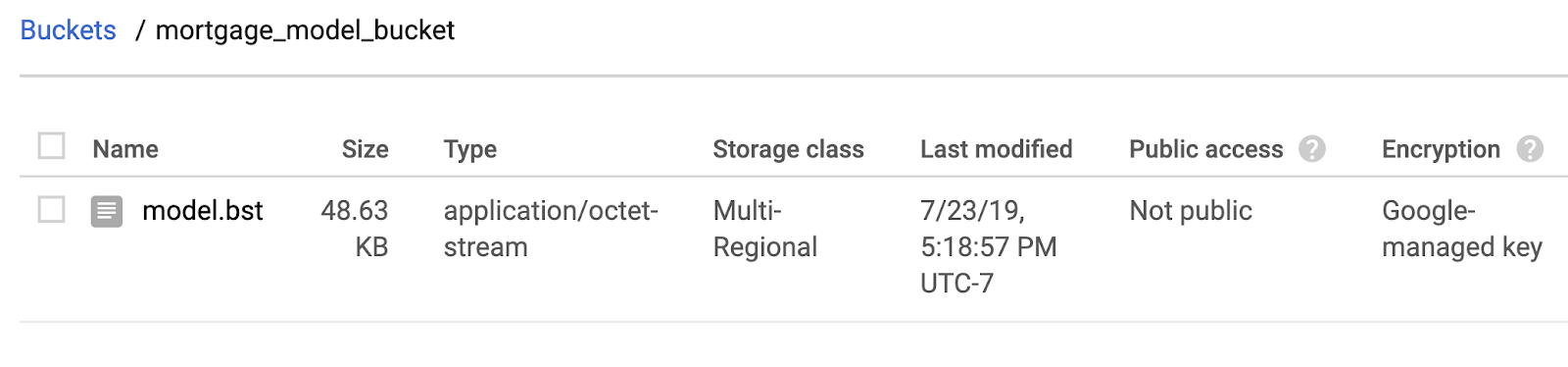
print(acc)Before we can deploy the model, we’ll save it to a local file:
model.save_model('model.bst')Deploying the model to Cloud AI Platform
It’d be nice if we could query our model from anywhere, not just within our notebook. So let’s deploy it 🚀
You can deploy it anywhere, but I’m going to deploy it to Google Cloud (because I work there 😀) and also because we’ll be able to do something cool with the deployed model in the next section.
First, let’s set up some environment variables for our GCP project:
GCP_PROJECT = 'your-gcp-project'
MODEL_BUCKET = 'gs://storage_bucket_name' # Name must be globally unique
VERSION_NAME = 'v1'
Next step is to create a Cloud Storage bucket for our saved model file and copy the local file to our bucket. You can do this using gsutil (the Storage CLI) directly from your notebook:
!gsutil mb $MODEL_BUCKET
!gsutil cp ./model.bst $MODEL_BUCKET
Head over to your storage browser in your Cloud Console to confirm the file has been copied:
Next, use the gcloud CLI to set your current project and then create an AI Platform model (you’ll deploy it in the next step):
!gcloud config set project $GCP_PROJECT
!gcloud ai-platform models create xgb_mortgage
And finally, you’re ready to deploy it. Do that with this gcloud command:
!gcloud ai-platform versions create $VERSION_NAME \
--model=$MODEL_NAME \
--framework='XGBOOST' \
--runtime-version=1.14 \
--origin=$MODEL_BUCKET \
--python-version=3.5 \
--project=$GCP_PROJECT
While this deploys you can check the models section of your AI Platform console and you should see your new version deploying. When it completes (about 2-3 minutes), you’ll see a green checkmark next to your model version. Woohoo! 🎉
Once your model is deployed, chances are you probably don’t want to stop there. Let’s send a test prediction to the model using gcloud. First, we’ll save the first example from our test set to a local file:
%%writefile predictions.json
[2016.0, 1.0, 346.0, 27.0, 211.0, 4530.0, 86700.0, 132.13, 1289.0, 1408.0, 0.0, 0.0, 0.0, 0.0, 1.0, 0.0, 1.0, 0.0, 0.0, 0.0, 0.0, 1.0, 0.0, 1.0, 0.0, 1.0, 0.0, 0.0, 0.0, 1.0, 0.0, 0.0, 0.0, 0.0, 0.0, 0.0, 0.0, 0.0, 0.0, 1.0, 0.0, 0.0, 1.0, 0.0]
And then get a prediction from our model:
prediction = !gcloud ai-platform predict --model=xgb_mortgage --json-instances=predictions.json --version=$VERSION_NAME
print(prediction)
Interpreting the model with the What-if Tool
The What-if Tool is a super cool visualization widget that you can run in a notebook. I’ve blogged about it already so I will jump to showing you how it works here. You can connect it to models deployed on AI Platform, so that’s exactly what we’ll do here:
def adjust_prediction(pred):
  return [1 - pred, pred]

config_builder = (WitConfigBuilder(test_examples.tolist(), data.columns.tolist() + ['mortgage_status'])
  .set_ai_platform_model(GCP_PROJECT, MODEL_NAME, VERSION_NAME, adjust_prediction=adjust_prediction)
  .set_target_feature('mortgage_status')
  .set_label_vocab(['denied', 'approved']))
WitWidget(config_builder, height=800)
When you run that you should get something like this (yours won’t be exactly the same since all ML models have some element of randomness associated with weight and bias initialization):
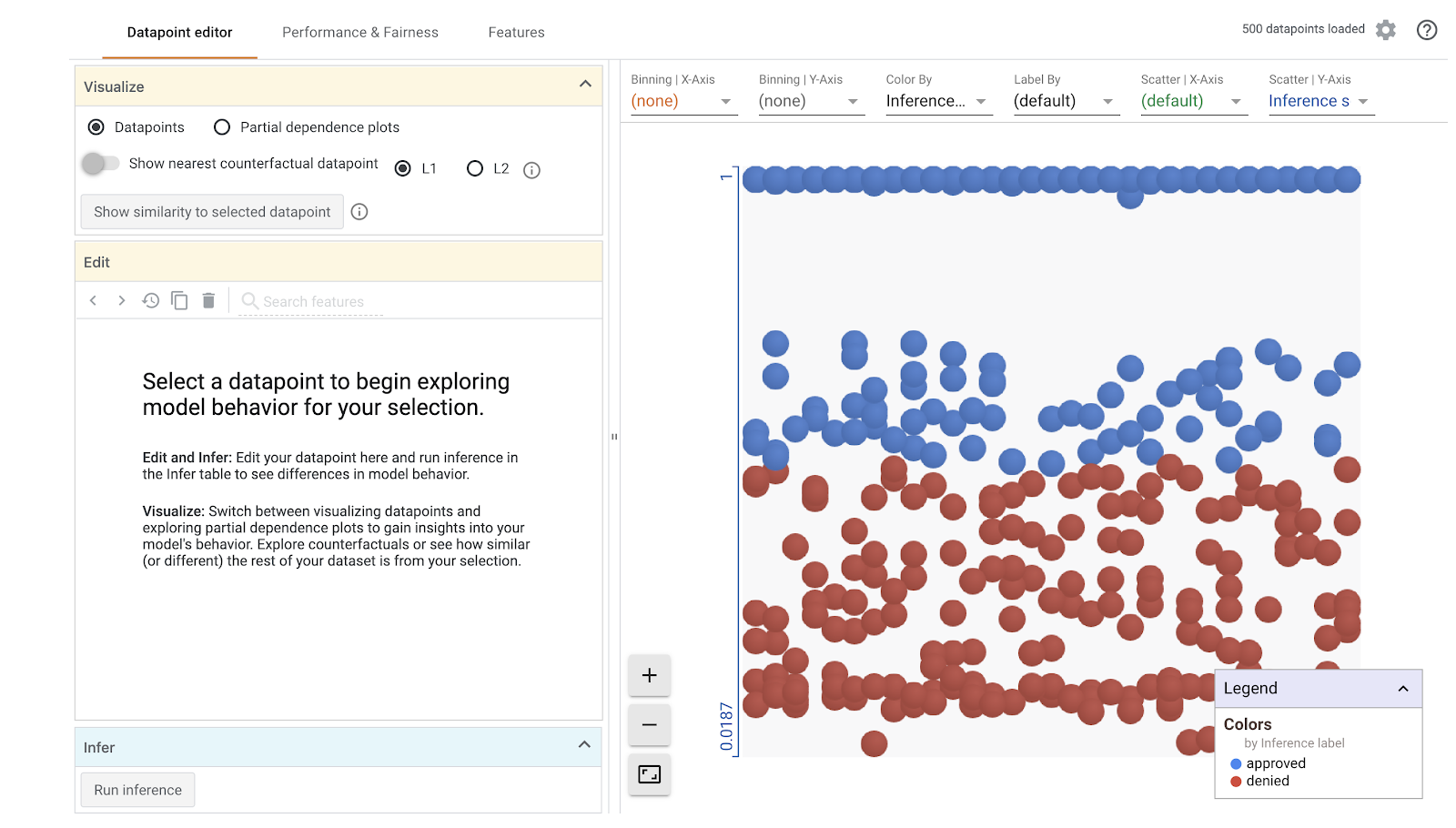
The Datapoint Editor
In the Datapoint editor tab you can click on individual datapoints, change their feature values, and see how this affects the prediction. For example, if I change the agency the loan originated from in the datapoint below from the CFPB to HUD, the likelihood of this loan being approved decreases by 32%:
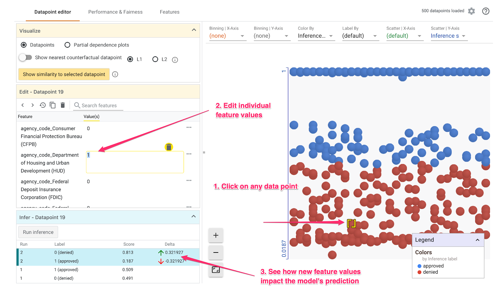
In the bottom left part of the What-if Tool we can see the ground truth label in the Label column, along with what the model predicted in the Score column.
You can also do a cool thing called Counterfactual analysis here. If you click on any datapoint, and then select “Show nearest counterfactual datapoint,” the tool will show you the datapoint that has features most similar to the original one you selected, but the opposite prediction:
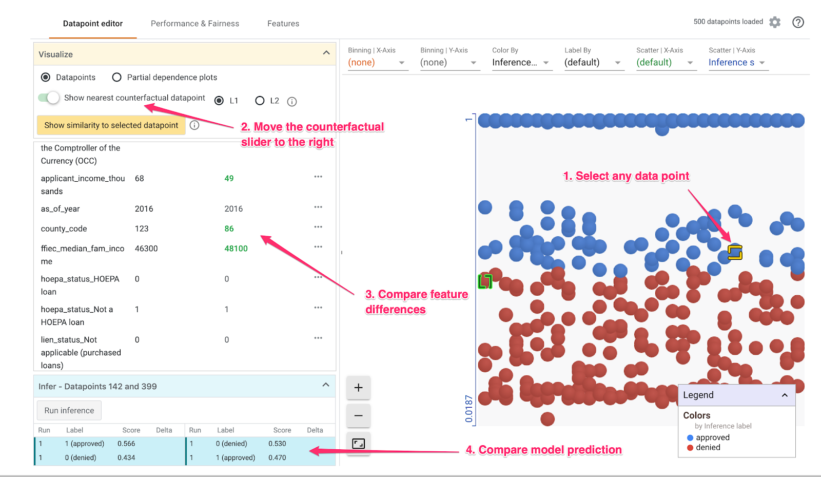
Then you can scroll through the feature values to see where the datapoints differed.
But wait, there is even more you can do in the datapoint editor. If you deselect any datapoints and then select “Partial dependence plots,” you can see how much an individual feature affected the model’s prediction:
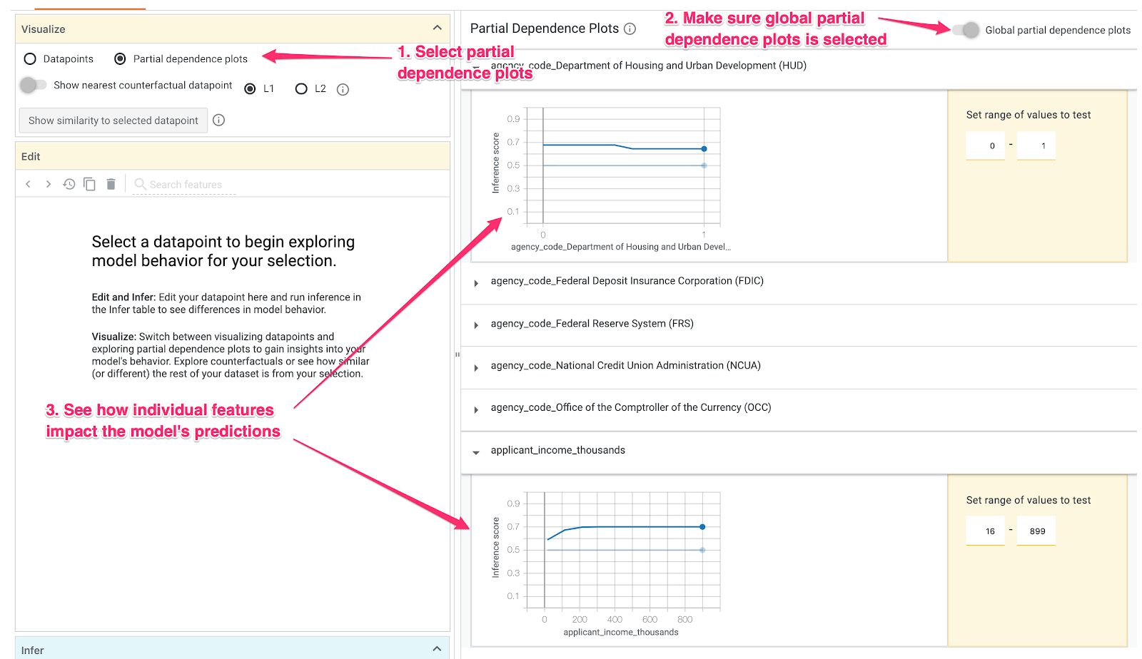
Because agency_code_HUD is a boolean feature, we’ve only got 0 and 1 values for each example. Here it looks like loans originating from HUD have a slightly higher likelihood of being denied.
applicant_income_thousands is a numerical feature, and in the partial dependence plot we can see that higher income slightly increases the likelihood of an application being approved, but only up to around $200k. After $200k, this feature doesn’t impact the model’s prediction.
Model Performance & Fairness
On the Performance & Fairness tab we can slice by a specific feature and see if accuracy and error rates stay the same for different feature values. First, select mortgage_status as the Ground Truth Feature. Then slice by any other feature you’d like. I’ll continue analyzing the agency_code_Department of Housing and Urban Development (HUD)
feature:
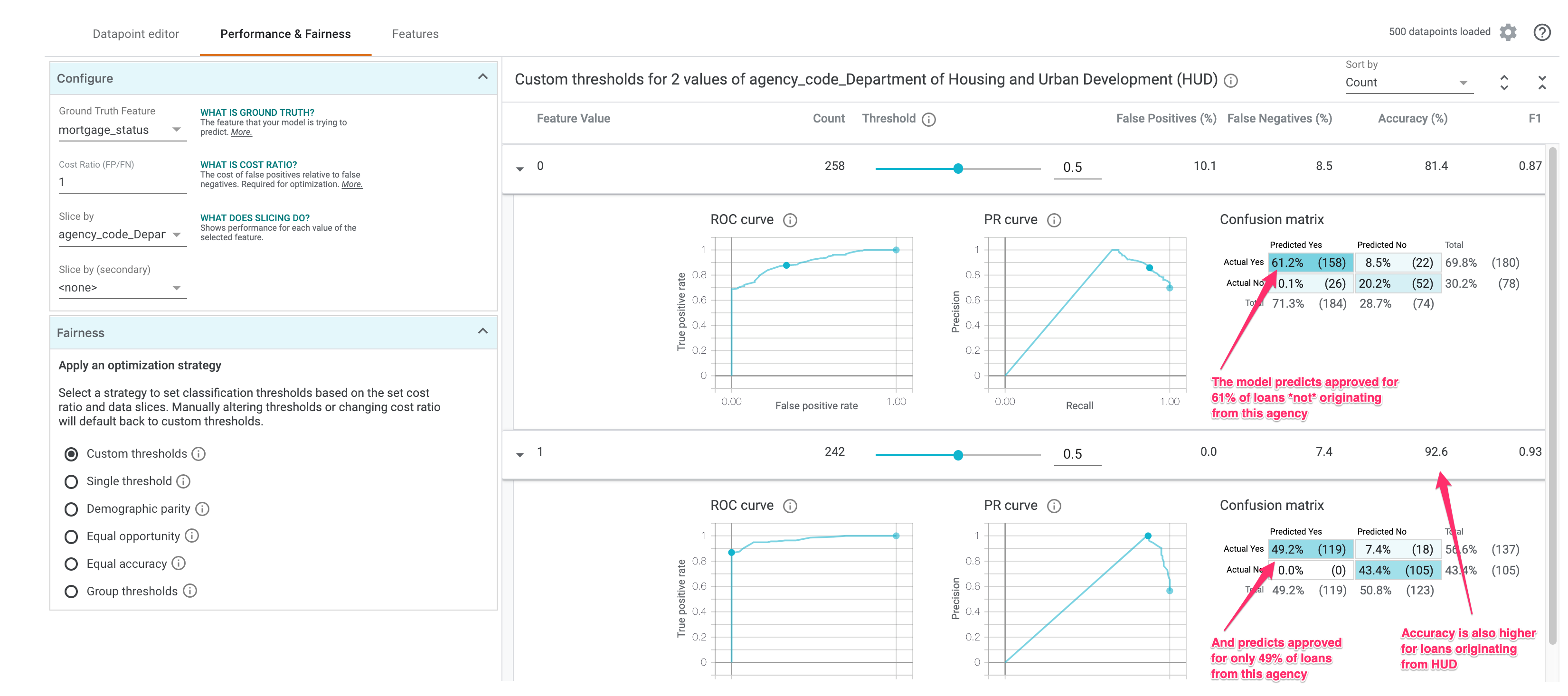
Notice that the model predicts approved 61% of the time when this feature value is 0 (loan came from any other agency), but approves only 49% of the time when a loan came from HUD. Interestingly, model accuracy is also higher when this feature value is 1.
Let’s see we don’t want our model to discriminate on this feature. We can add a strategy depending on what we want our model to optimize for. Select Demographic parity from the radio buttons on the bottom left of the What-if Tool:
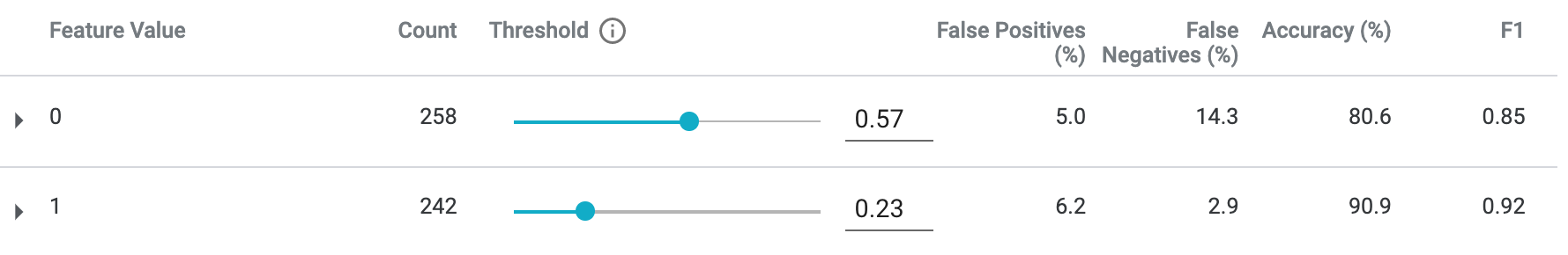
This will adjust the Threshold so that similar percentages of each feature value are predicted as approved. The threshold is the value of each class we’ll use as the decision point for a prediction. In the example above, for loans not originating from HUD, we should mark any prediction above 57% as approved. For loans that did originate from HUD, we should mark any prediction above 23% as approved.
The Equal opportunity strategy will instead adjust the threholds so that there are a similar number of correct positive classifications for each class.
There’s lots more you can do with the What-if Tool. The Features tab lets you see the distribution of examples for each feature in your dataset. I’ll let you keep exploring the tool on your own!
Interpreting our model with SHAP
We can also use the open source library SHAP to do some interesting model analysis, both on individual predictions and the model as a whole. I’ve done a few posts on SHAP before if you want to learn more.
We’ll use SHAP’s TreeExplainer since we’ve got an XGBoost tree-based model:
import shap

explainer = shap.TreeExplainer(model)
shap_values = explainer.shap_values(x_train)
Now we can inspect what contributed to the prediction of an individual example. Here we’ll use the first example from our training dataset:
shap.initjs()
shap.force_plot(explainer.expected_value, shap_values[0,:], x_train.iloc[0,:])
This gives us a nice visualization of how different features pushed the prediction up or down (the feature names are long so some of them are cut off here):

For this particular example the model predicted the application would be approved with 86% confidence. It looks like the loan agency, the applicant’s income, and the amount of the loan were the most important features used by the model in this prediction.
We can also use SHAP to see how much a particular feature value affected predictions:
shap.dependence_plot("loan_purpose_Home purchase", shap_values, x_train)The result is similar to the What-if Tool’s partial dependence plots but the visualization is slightly different:
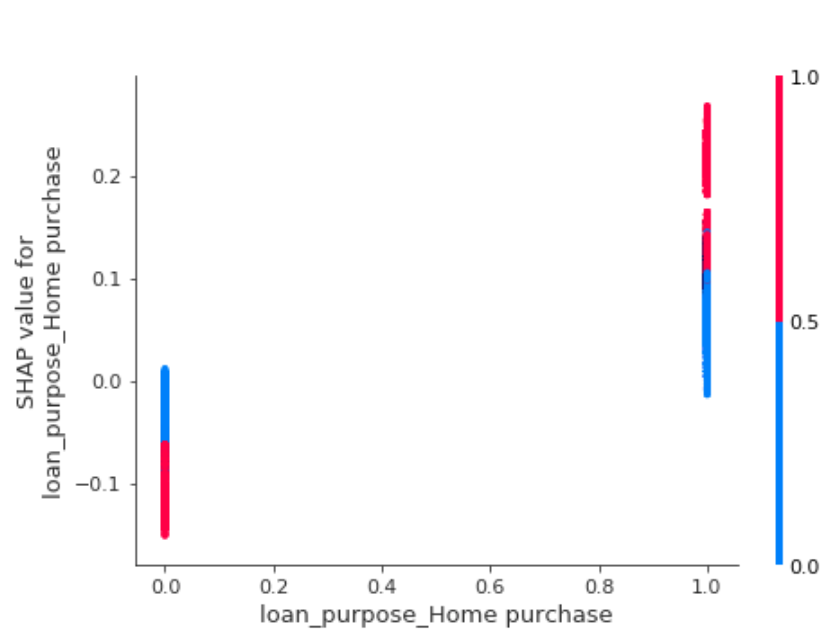
This shows us that our model was more likely to predict approved for loans that were for home purchases.
Finally, with SHAP’s summary_plot we can see the features that had the highest impact on model output:
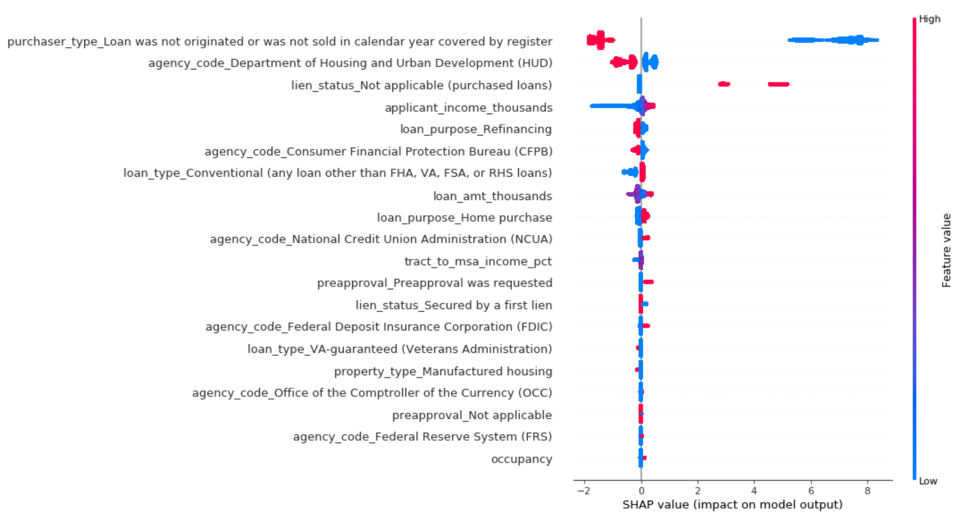
Interestingly the feature “Loan not originated or sold in calendar year” is influencing our model’s predictions the most. Loans with a 1 for this feature mean that they were not sold to institutional investors or government agencies. And according to SHAP, loans that weren’t sold are less likely to be predicted approved by our model.
Next steps
Hopefully now you’ve got a good idea of some tools for understanding how your model is making predictions. This post was really long but I decided to roll with it based on the results of this Twitter poll 😀
Do you prefer a blog post that goes through all the steps + code snippets of how to get something working, or one that is short and sweet with summaries of the highlights?
— Sara Robinson (@SRobTweets) July 31, 2019
Did you like it, dislike it, or have ideas for future posts? Let me know on Twitter. Here’s links for more on everything I covered: